Web 210: Advanced Web Design
Styleguide
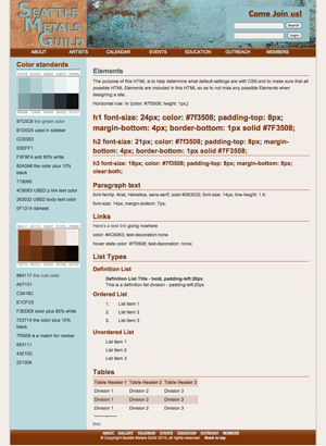
a very helpful new tool I may start using, a generic html page which draws on all the styles in the css.
Here's a printable version.
Visual design to html template for Wordpress
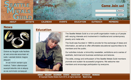
Visual design is done, and now we are on to coding the page templates which will be used in the WordPress installation. I used a combination of Raven Gildea's starter page code and Mike Sinkula's WEB200 demo page to make this. Since we used a 960 grid and a 4-col layout with 40 pixel gutters for all our designs, the template should be versatile enough to weather any changes.
I tried to make the structural divs without a wrapper the way Mike does, but the footer kept floating upward, so I added it in after admitting defeat.
Here's the link to the proto-site.
Punched Metal Effect in Photoshop
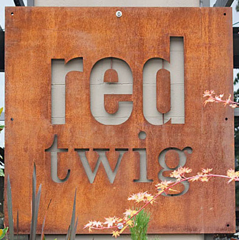
(Full disclosure: I had nothing at all to do with the Red Twig sign, outside of admiring it and enjoying their cafe.) We took an example from the graphic playbook of Edmonds eatery Red Twig and set out to make a punched metal look logo. I learned some great new tricks from Photoshop instructor Martin McCann. Here's how I did it in CS4.

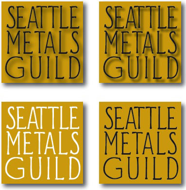
Seattle Metals Guild logo - some choices for client's perusal
Seattle Metals Guild - my rendition of their logo. Grey background can be any middle-range color we choose. It smalls down well. It avoids iconography, which I was having trouble finding. Crucible? Hammer? Gold mine? What says metal? So I just spelled it out. I like the mid-century font, reminiscent of craftsman crafting, tinkers tinkering, smithers smithing.
Another version uses a deco font that looks a bit like iron nails on a background of brass color.
With logos I think it's a real plus if it is readable at 40 pixels square. Both of these logos work for readability, though the drop-shadow effect doesn't show up.
Dimensional look tab div background thing
Ignore the color for now; I like the dimensional tab motif and am figuring out how to make it work in a div as a background. Here it is on a template.

