Web 114: Photoshop
Assignment Zip files
web114/strom-web114-01-a02.zip
web114/strom-web114-01-a03.zip
web114/strom-web114-01-a04.zip
web114/strom-web114-01-a05.zip
web114/strom-web114-01-a06.zip
web114/strom-web114-01-a07.zip
web114/strom-web114-01-a07x.zip
web114/strom-web114-01-a09.zip
web114/strom-web114-01-a10.zip
web114/strom-web114-01-a11.jpg
web114/strom-web114-01-a12final.zip
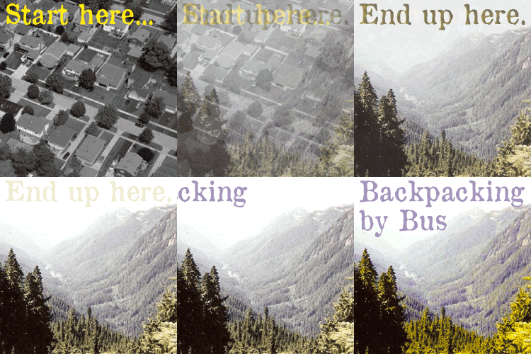
A06 - Animated GIFs
(refresh your browser screen to see gifs in action, click small image to view larger version of frame animation in a new window)
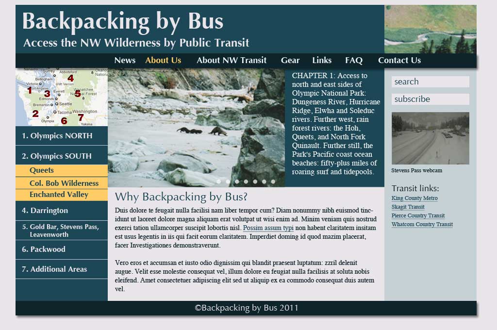
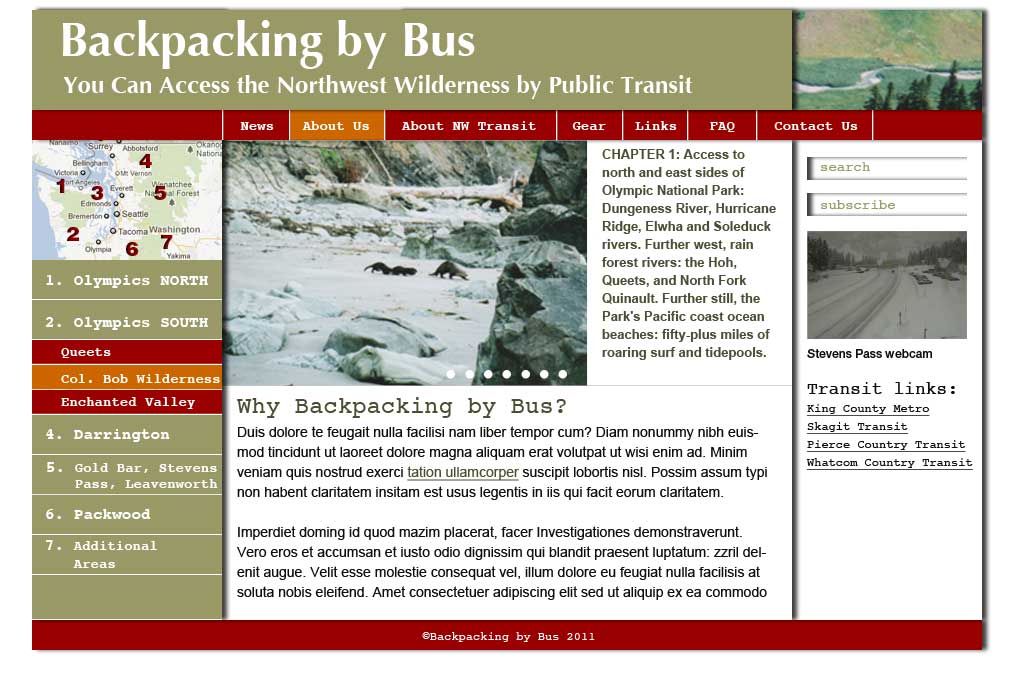
A08 - Design critique
Refined design, with link colors and hover states, pretty much thrown out the window in a few versions.
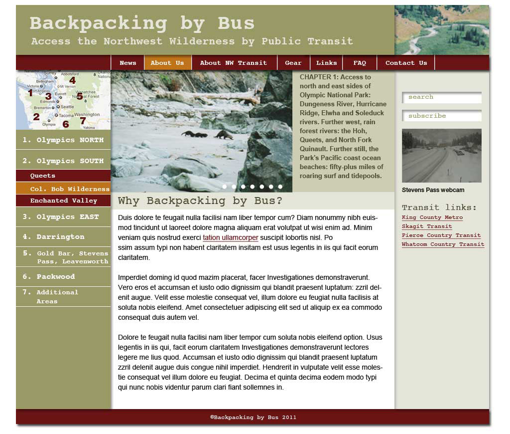
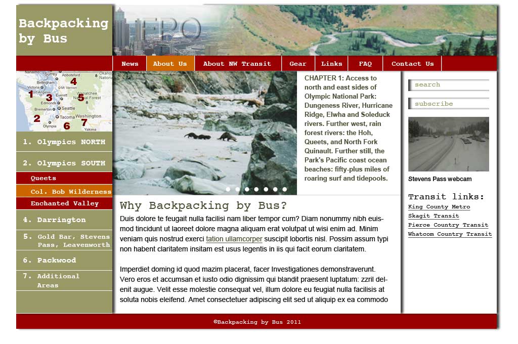
A09 - Rough design
Refined design, with link colors and hover states, pretty much thrown out the window in a few versions.
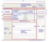
A11 - Redlines
Specifying layout elements in case someone else does the coding from my design. Photoshop is not the best tool for making notes and dimensioning. Left to my own devices, I'd have printed it out and taken a fat red sharpie to it. I could have coded it in html faster.
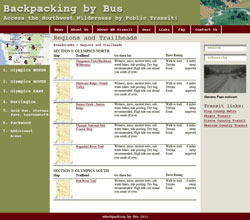
A12 Final presentation
A nice fat pdf with main page, main page with hover states, second page, a page with lists of stuff (in this case a list of Green Trails and USGS maps for each region), and a modern version of the old contact sheet (where there are no negatives to come into contact with non-existent print paper) of images to be used in the site.

