Fall 2009

Mike Sinkula's Typography for the Web covers graphic goodness like fonts and typefaces, creating logos, type spacing and sizes, reliable layouts, illustrator, white space, color, and more. This is dangerous knowledge. There are a good many websites out there that violate the basic rules of typography at every turn, and I am prone to point them out to even the least interested bystander. This makes me more insufferable than ever.

I also developed a logo for myself which surprises me by how robust it is. It adapts to a good many applications and I have yet to grow tired of it. I credit the success of the logo to Mike, who took my early efforts and threw out most of the gimmicks I laid on a simple typographic design, to distill it down to a distinct and unique design.

thin

Contact information

Feeds


  • panoramio
  • Follow LeslieStrom on Twitter
  • LinkedIn profile
  • Internet Movie Database
  • Vimeo
  • adobe reader

Web 112: Typography for the Web

Final presentation: the evolution of the bio page

1

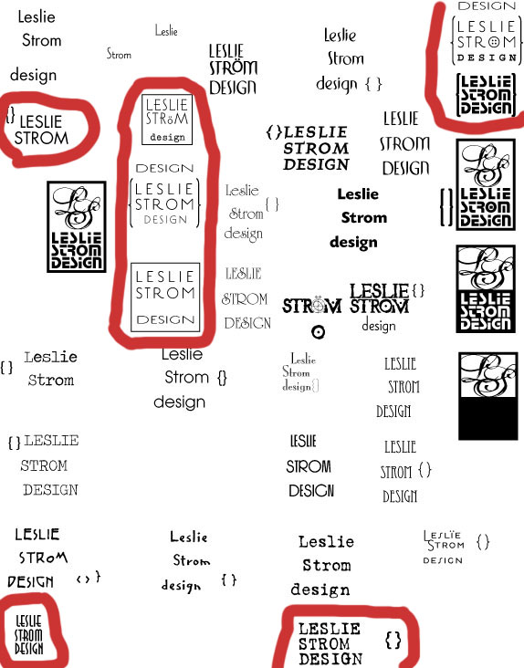
1 Fiddling with fonts - I hung on to the containing box element until the bitter end.
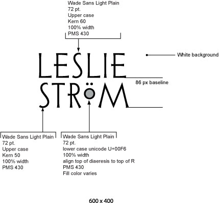
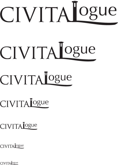
2

2 Logotype spec

3

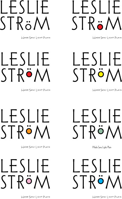
3 Fiddling with colors

4

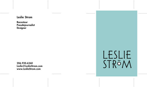
4 Business card front and back

5

5 Trying sizes for readability. black on white, 20 px high smallest is still readable

5

black on a medium tone, smallest isn't readable without contrast.

5

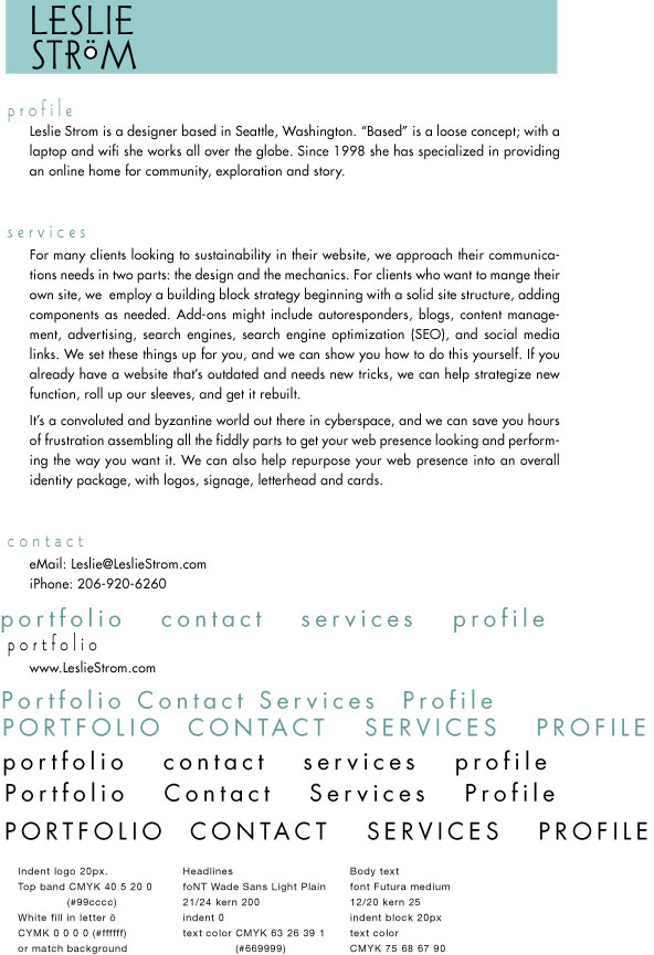
6 Bio Page 1 - green and Wade Sans light are hard to read, so settled on 21px.

Wanted to maintain either color or font. Green Futura would have also worked.

transfer

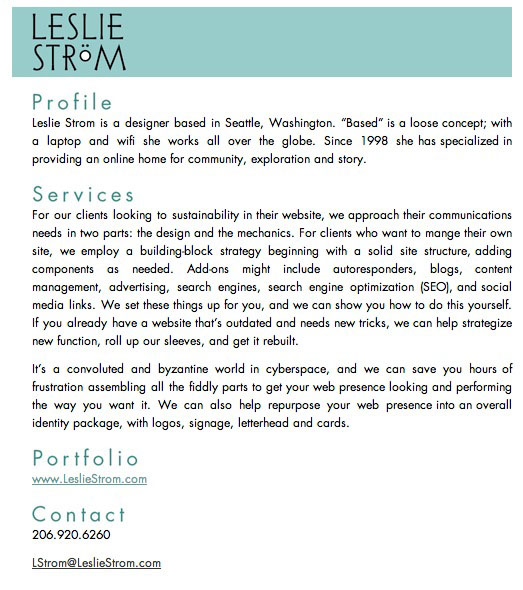
smallest is 20px high. still readable!

icon

favicon 16x16