Web 205: A5 - Fabulous Five Portfolio Links
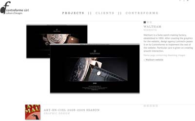
- What I like: Cool, two languages, assumes the viewer has a brain, lots of great design to look at, Lightbox effect when you click on stuff
- What I don't like: The light grey is hard to read, logo doesn't return to index page, no contact form, they might be a bit too mysterious for their own good.
- What I like: The name cracks me up completely. Flash site successfully encourages viewer to navigate with keyboard. Flash is quite innovative and nicely done.
- What I don't like: Flash animation a bit too sprightly and jumpy and I got lost trying to re-orient myself after every click. Important titles turned 90 degrees a little hard to read. You have to do a bit of work to use the site and it distracts from the content. For all that work, there is no contact form, just a link that starts an email. Going back to home is not obvious.
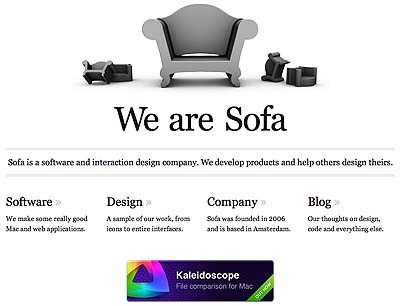
- What I like: I just love monochrome sites and all the white space. It's whimsical and a little mysterious. The tagline is simple and clear. I like the four columns for navigation and the hover states in red. The page never navigates away to another page; things just pop up in a Lightbox thing. Nice big type.
- What I don't like: A lot of scrolling. Not meant for a little laptop screen. I have no idea why they're called Sofa. No contact form; the link opens an email.
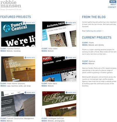
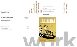
- What I like: Not just servicable (which always sounds like a backhanded insult but this time it's not), it's elegant. Interior pages really sell the work he's done. Images are all relevant and very good and consistent. Navigation couldn't be easier. Examples of his work are really excellent. Site easy to scan, easy to dig into. He actually has a "welcome to my source code" note!
- What I don't like: Type is that small grey hard-to-read stuff. Line lengths, especially for the type size, are too long for easy reading.
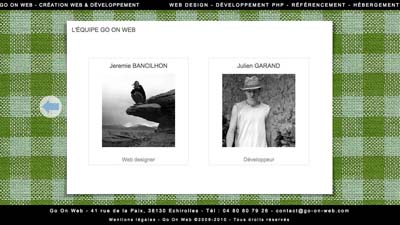
- What I like: Cool fabric background effect changes color. Compelling images. Fun to look around at stuff. Fast loading. It even works great on an iPhone, including hovers, sliders and transparencies! Some text in English. Many of their example sites are wicked cool.
- What I don't like: Name might be compressed to GoonWeb. Their own logo is clumsy. There is no contact form, surprising after all that wonderful scripting and claim to php services.


Valid HTML, Valid CSS. Hurrah!