


Case Studies - the Impact of Color

Selecting the Perfect Page Palette From a Picture
This is a technique I learned from the fabulously instructive Before and After Magazine tutorial "How to find the perfect color" (this one is a free download, and all his stuff is worth the modest price for a feet-wet education in graphic arts).
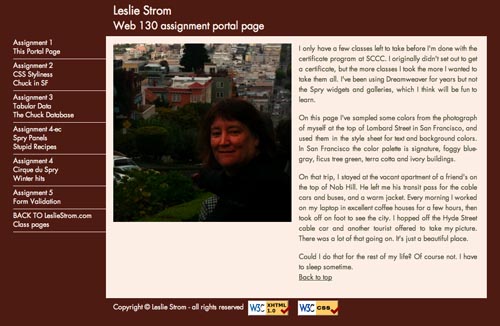
For my WEB 130 Adobe Dreamweaver CS5 class portal page, I started with a picture of myself taken in San Francisco. The quality of light in San Francisco is unique, and I think this method captures the palette well. I selected light colors for backgrounds, medium tones for link colors, and darks for text. Here's the commented code I put at the top of the CSS stylesheet:
/* web130 css */
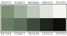
/* colors from photo to use
fceee5 sandy bank light
bfc7d2 hills in distance light
99afbd water blue medium
925445 face medium
59291b terra cotta house dark
454a2a ficus tree dark */
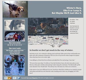
Another palette from a wintery image
Winter colors are very subtle, and taking a palette from an image and also running it through the tints and shades generator (see below) gives workable darker colors for text and link colors.
/*

          ebebdf light snow text and bg

          e3e2e0 crane sky

          818f9a mid blue gray snow shadow

          a76b6d med red brick h1 h2

          505558 dark text

          */

A Quick spruce-up for Art Cloth for the Soul
This was a simple aesthetic upgrade. Art Cloth for the Soul had photographs of Marie Plakos' art pieces centered on a black screen with some white text on top. Never mind that there were no actual whites in the art pieces.
This one-page place-holder site got the Tints and Tones Treatment, using this familiar midtone green gray I used on my own portfolio site.
- I changed the text colors to tints or tones of the base gray-green.
- There are no white design elements.
- There's a new pinstripe background image to fill out the screen, using black and tones of green gray.
It's a great technique which gives a subtle and elegant color continuity to a page. Harsh contrast is avoided and the colors enhance the artwork nicely.
HOW IT'S DONE: Typically I will run a color through the SlayerOffice.com color palette generator then copy the hexidecimal numbers into my css style sheet for easy access.
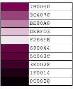

Case study - Alpha Physical Therapy
Margaret's physical therapy brochure had a signature color, a lively magenta that broke out into wonderful colors when run through the palette generator. I didn't want any banal tints for this site! The Palette looked great and I managed to use almost all the colors in the text, the links, the menu bar, the rollover blocks. The effect is harmonious and lovely.
See Alpha Physical Therapy website
The hex color numbers in my code example are from an illustrator technique I used following Mike Sinkula's method. Here's the commented code I put in the head of my css file, for any geeks who might care:
 /*

          Alpha Physical Therapy Woodinville website styles

          April 2010
          banner color  #81005d

          menubar color #44002b
        e4ccda 80% white added

          cb98b7 60%

          b26694 40%

          973371 20%

          7b0050 THE COLOR

          79004d 20% black added

          5b003b 40%

          44002b 60%

          2a0016 80%

          */