Compositions for Backpacking By Bus.com
Dave - Please review these comps for your new website for Backpacking By Bus. Any comment will be gladly considered and mostly ignored. We've been friends a long time. I can read your mind. No, really.
Thanks,
Leslie Strom, Editora
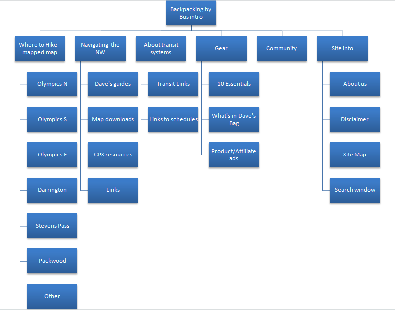
The following dazzling org chart shows how the site pages will be organized and about how the site will flow. It also gives you an idea of the kind of content we'll be needing. We'll be repurposing your articles from Get Lost Magazine, and the new things you've written, and can add the other bits on later. Sort of a Snap-On Tools model, if you will. If the amount of content is daunting for now, we can put it in later. I don't want any tears here. Especially my own.
Design First tier of site:
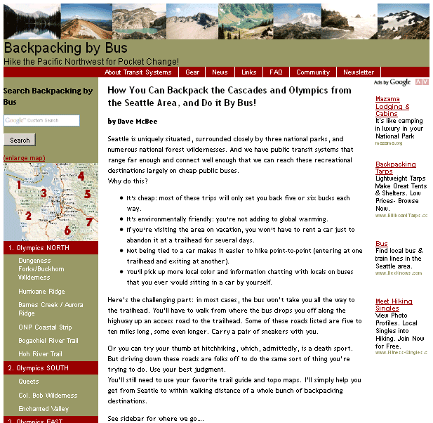
This is the main page visitors will see first.
A few design/layout details:
- Overall design of the site is geared to be accessible by people with older computers, and even iPhones and iPod Touches. There's nothing that would trip up a novice user.
- Pictures in the banner are from your own travels.
- General navigation buttons are across the top under the banner.
- Because we're navigation freaks, there will also be a site map to show where everything is at a glance.
- There is a newsletter link to sign up for a newsletter you can manage through aWeber. Once they leave a way to contact them, you can engage in "push marketing" by sending them notes on updates and news of interest.
- A WordPress Bulletin Board will provide interactive forums (fora?) for your readers to share their experiences. If they survive them. There's a loveable "bozo filter" which allows you to mark well-meaning blowhards to post and see their own marvellous comentary, but no one else will have to endure it. (If you use this on me, I'll sue you.)
- There is a search tool near the top to search the site for people to search for words like "Hoh" and "Humptulips".
- The general map of Western Washington is an image map, so that viewers can click on the numbered area and go to the page telling about all the hikes there. If they don't know where Humptulips is, and they know they want to be in the area of, say, Mount Rainier, they can just click.
- There is redundant navigation since the site has a lot of information; vertical navigation links to the seven areas you've written up, with the individual hikes under them.
- Google adsense ads are in the right sidebar. Your best bet for monetizing this effort early on is google adsense ads which I suggest for the sidebar on each page, and links to affiliate programs that pay commissions for the selling of camping gear. There's room for those things. It's also a numbers game, and so the more readers, the more money the site (and you and I) make. Simple math.
Design Tier 2 of site:
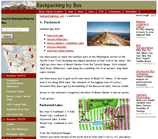
This is what most of the other pages will look like.
A few design layout details:
- The top banner is smaller now, without the pictures, to gain more page "real estate".. The image in the left corner is a link back to home page. Users have come to expect this link in websites.
- The horizontal and vertical navigations are in the same place.
- Another new thing on the secondary pages is a "breadcrumb" link, so that readers will easily know where they are and how to get back out again. Sort of a website gps. Ha.
- Long articles get a "back to top" link at the end of logical segments. .
- The pages that cover regions are pretty long, but will be punctuation with pictures and the area maps you drew.
And in conclusion...
Let me know how this works for you. Did I remember everything? Is there too much? Let me know.